source: http://www.codeproject.com/Articles/1465/Beginning-C-Chapter-Using-Windows-Form-Controls
Using Windows Form Controls
In recent years, Visual Basic has won great acclaim for granting programmers the tools for creating highly detailed user interfaces via an intuitive form designer, along with an easy to learn programming language that together produced probably the best environment for rapid application development out there. One of the things that Visual Basic does, and other rapid application development tools, such as Delphi, also does, is provide access to a number of prefabricated controls that the developer can use to quickly build the user interface (UI) for an application.
At the center of most Visual Basic Windows applications stands the form designer. You create a user interface by dragging and dropping controls from a toolbox to your form, placing them where you want them to be when you run the program, and then double-clicking the control to add handlers for the control. The controls provided out of the box by Microsoft along with custom controls that can be bought at reasonable prices, have supplied programmers with an unprecedented pool of reusable, thoroughly tested code that is no further away than a click with the mouse. What was central to Visual Basic is now, through Visual Studio.NET, available to C# programmers.
Most of the controls used before .NET were, and still are, special COM objects, known as ActiveX controls. These are usually able to render themselves at both design and runtime. Each control has a number of properties allowing the programmer to do a certain amount of customization, such as setting the background color, caption, and its position on the form. The controls that we'll see in this chapter have the same look and feel as ActiveX controls, but they are not – they are .NET assemblies. However, it is still possible to use the controls that have been designed for older versions of Visual Studio but there is a small performance overhead because .NET has to wrap the control when you do so. For obvious reasons, when they designed .NET, Microsoft did not want to render the immense pool of existing controls redundant, and so have provided us with the means to use the old controls, even if future controls are built as pure .NET components.
These .NET assemblies can be designed in such a way that you will be able to use them in any of the Visual Studio languages, and the hope and belief is that the growing component industry will latch on, and start producing pure .NET components. We'll look at creating control ourselves in the next chapter.
An in depth explanation of .NET assemblies is provided in Chapter 21. Please refer to it if you want to know more about what an assembly is.
We have already seen the form designer in action, if only briefly, in the examples provided earlier in this book. In this chapter, we'll take a closer look at it, and especially how we use a number of controls, all of which come out of the box with Visual Studio.NET. Presenting all of the controls present in Visual Studio.NET will be an impossible task within the scope of this book, and so we'll be presenting the most commonly used controls, ranging from labelsand text boxes, to list views and status bars.
The Windows Form Designer
We'll start out by taking a brief tour of the Windows Form Designer. This is the main playing ground when you are laying out your user interface. It is perfectly possible to design forms without using Visual Studio.NET, but designing an interface in Notepad can be a quite painful experience.
Let's look at the environment we'll be using. Start Visual Studio.NET and create a new C# Windows Application project by selecting File | New | Project. In the dialog that appears, click Visual C# Projects in the tree to the left and then select Windows Application in the list to the right. For now, simply use the default name suggested by Visual Studio and click OK. This should bring up a window much like the one shown below:
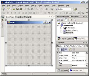 |
If you are famliar with the forms designer found in Visual Basic you will notice the similarities – obviously someone desided that the designer was a winner and desided to allow it to be used it in other Visual Studio languages as well. If you are not familiar with the Visual Basic designer, then quite a few things are going on in the above screenshot, so let's take a moment and go through the panels one by one.
In the center of the screen is the form that you are designing. You can drag and drop controls from the toolbox onto the form. The toolbox is collapsed in the picture above, but if you move the mouse pointer to the far left of the screen over the Toolbox tab, it will unfold. You can then click the pin at the top right of the panel to pin it down. This will rearrange the work area so that the toolbox is now always on top, and isn't obscuring the form. We'll take a closer look at the toolbox and what it contains shortly.
Also collapsed on the left hand bar is the Server Explorer – represented by the computers icon on top of the toolbox tab. You can think of this as a small version of the Windows Control Panel. From here, you can browse computers on a network, add and remove database connections, and much more.
To the right of the window are two panels. The top-right one is the Solution Explorer and the class view. In the Solution Explorer, you can see all open projects and their associated files. By clicking the tab at the bottom of the Solution Explorer, you activate the Class Viewer. In this, you can browse all of the classes in your projects and all of the classes that they are derived from.
At the bottom right of the screen, is the Properties panel. This panel will contain all of the properties of the selected item for easy reference and editing. We'll be using this panel quite a bit in this chapter.
Also in this panel, the Dynamic Help tab is visible. This panel will show help tips to you for any selected objects and code even while you type. If your computer uses one of the older microprocessors or has a small amount of RAM, then I suggest that you remove this from the panel when it is not needed, as all that searching for help can make performance rather sluggish.
The Toolbox
Let's have a closer look at the toolbox. If you haven't already, move your mouse pointer over the toolbox on the left of the screen, and pin it to the foreground by clicking the pin at the top right of the panel that unfolds:
If you accidentally remove the toolbox by clicking the X instead, you can make it reappear by selecting Toolbox from the View menu, or by pressing Ctrl-Alt-X.
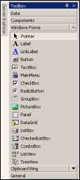 |
The toolbox contains a selection of all the controls available to you as a .NET developer. In particular, it provides the selection that is of importance to you as a Windows Application developer. If you had chosen to create a Web Forms project, rather than a Windows Application, you would have been given a different toolbox to use. You are not limited to use this selection. You can customize the toolbox to fit your needs, but in this chapter, we'll be focusing on the controls found in the selection that is shown in the picture above – in fact, we'll look at most of the controls that are shown here.
Now that we know where we'll be doing the work, let's look at controls in general.
Controls
Most controls in .NET derive from the System.Windows.Forms.Control class. This class defines the basic functionality of the controls, which is why many properties and events in the controls we'll see are identical. Many of these classes are themselves base classes for other controls, as is the case with the Label and TextBoxBase classes in the diagram below:
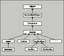 |
Some controls, named custom or user controls, derive from another class: System.Windows.Forms.UserControl. This class is itself derived from the Control class and provides the functionality we need to create controls ourselves. We'll cover this class in Chapter 14. Incidentally, controls used for designing Web user interfaces derive from yet another class, System.Web.UI.Control.
Properties
All controls have a number of properties that are used to manipulate the behavior of the control. The base class of most controls, Control, has a number of properties that other controls either inherit directly or override to provide some kind of custom behavior.
The table below shows some of the most common properties of the Control class. These properties will be present in most of the controls we'll visit in this chapter, and they will therefore, not be explained in detail again, unless the behavior of the properties is changed for the control in question. Note that this table is not meant to be exhaustive; if you want to see all f the properties in the class, please refer to the MSDN library:
| Name | Availability | Description |
| Anchor | Read/Write | Using this property, you can specify how the control behaves when its container is resized. See below for a detailed explanation of this property. |
| BackColor | Read/Write | The background color of a control. |
| Bottom | Read/Write | By setting this property, you specify the distance from the top of the window to the bottom of the control. This is not the same as specifying the height of the control. |
| Dock | Read/Write | Allows you to make a control dock to the edges of a window. See below for a more detailed explanation of this property. |
| Enabled | Read/Write | Setting Enabled to true usually means that the control can receive input from the user. Setting Enabled to false usually means that it cannot. |
| ForeColor | Read/Write | The foreground color of the control. |
| Height | Read/Write | The distance from the top to the bottom of the control. |
| Left | Read/Write | The left edge of the control relative to the left edge of the window. |
| Name | Read/Write | The name of the control. This name can be used to reference the control in code. |
| Parent | Read/Write | The parent of the control. |
| Right | Read/Write | The right edge of the control relative to the left edge of the window. |
| TabIndex | Read/Write | The number the control has in the tab order of its container. |
| TabStop | Read/Write | Specifies whether the control can be accessed by the Tab key. |
| Tag | Read/Write | This value is usually not used by the control itself, and is there for you to store information about the control on the control itself. When this property is assigned a value through the Windows Form designer, you can only assign a string to it. |
| Top | Read/Write | The top edge of the control relative to the top of the window. |
| Visible | Read/Write | Specifies whether or not the control is visible at runtime. |
| Width | Read/Write | The width of the control. |
Anchor and Dock Properties
These two properties are especially useful when you are designing your form. Ensuring that a window doesn't become a mess to look at if the user decides to resize the window is far from trivial, and numerous lines of code have been written to achieve this. Many programs solve the problem by simply disallowing the window from being resized, which is clearly the easiest way around the problem, but not the best. The Anchor and Dock properties that have been introduced with .NET lets you solve this problem without writing a single line of code.
The Anchor property is used to to specify how the control behaves when a user resizes the window. You can specify if the control should resize itself, anchoring itself in proportion to its own edges, or stay the same size, anchoring its position relative to the window's edges.
The Dock property is related to the Anchor property. You can use it to specify that a control should dock to an edge of its container. If a user resizes the window, the control will continue to be docked to the edge of the window. If, for instance, you specify that a control should dock with the bottom of its container, the control will resize itself to always occupy the bottom part of the screen, no matter how the window is resized. The control will not be resized in the process; it simply stays docked to the edge of the window.
See the text box example later in this chapter for the exact use of the Anchor property.
Events
When a user clicks a button or presses a button, you as the programmer of the application, want to be told that this has happened. To do so, controls use events. The Control class defines a number of events that are common to the controls we'll use in this chapter. The table below describes a number of these events. Once again, this is just a selection of the most common events; if you need to see the entire list, please refer to the MSDN library:
| Name | Description |
| Click | Occurs when a control is clicked. In some cases, this event will also occur when a user presses Enter. |
| DoubleClick | Occurs when a control is double-clicked. Handling the Click event on some controls, such as the Button control will mean that the DoubleClick event can never be called. |
| DragDrop | Occurs when a drag-and-drop operation is completed, in other words, when an object has been dragged over the control, and the user releases the mouse button. |
| DragEnter | Occurs when an object being dragged enters the bounds of the control. |
| DragLeave | Occurs when an object being dragged leaves the bounds of the control. |
| DragOver | Occurs when an object has been dragged over the control. |
| KeyDown | Occurs when a key becomes pressed while the control has focus. This event always occurs before KeyPress and KeyUp. |
| Name | Description |
| KeyPress | Occurs when a key becomes pressed, while a control has focus. This event always occurs after KeyDown and before KeyUp. The difference between KeyDown and KeyPress is that KeyDown passes the keyboard code of the key that has been pressed, while KeyPress passes the corresponding char value for the key. |
| KeyUp | Occurs when a key is released while a control has focus. This event always occurs after KeyDown and KeyPress. |
| GotFocus | Occurs when a control receives focus. Do not use this event to perform validation of controls. Use Validating and Validated instead. |
| LostFocus | Occurs when a control looses focus. Do not use this event to perform validation of controls. Use Validating and Validated instead. |
| MouseDown | Occurs when the mouse pointer is over a control and a mouse button is pressed. This is not the same as a Click event because MouseDown occurs as soon as the button is pressed and before it is released. |
| MouseMove | Occurs continually as the mouse travels over the control. |
| MouseUp | Occurs when the mouse pointer is over a control and a mouse button is released. |
| Paint | Occurs when the control is drawn. |
| Validated | This event is fired when a control with the CausesValidation property set to true is about to receive focus. It fires after the Validating event finishes and indicates that validation is complete. |
| Validating | Fires when a control with the CausesValidation property set to true is about to receive focus. Note that the control which is to be validated is the control which is losing focus, not the one that is receiving it. |
We will see many of these events in the examples in the rest of the chapter.
We are now ready to start looking at the controls themselves, and we'll start with one that we've seen in previous chapters, the Button control.
The Button Control
When you think of a button, you are probably thinking of a rectangular button that can be clicked to perform some task. However, technically there are three buttons in Visual Studio.NET. This is because radio buttons (as the name implies) and check boxes are also buttons. Because of this, the Button class is not derived directly from Control, but from another class called ButtonBase, which is derived from Control. We'll focus on the Button control in this section and leave radio buttons and check boxes for later in the chapter.
The button control exists on just about any Windows dialog you can think of. A button is primarily used to perform three kinds of tasks:
- To close a dialog with a state (for example, OK and Cancel buttons)
- To perform an action on data entered on a dialog (for example clicking Search efter entering some search criteria)
- To open another dialog or application (for example, Help buttons)
Working with the button control is very straightforward. It usually consists of adding the control to your form and double-clicking it to add the code to the Click event, which will probably be enough for most applications you'll work on.
Let's look at some of the commonly used properties and events of the control. This will give you an idea what can be done with it. After that, we'll create a small example that demonstrates some of the basic properties and events of a button.
Button Properties
We'll list the properties as members of the button base, even if technically they are defined in the ButtonBase base class. Only the most commonly used properties are explained here. Please refer to MSDN for a complete listing:
| Name | Availability | Description |
| FlatStyle | Read/Write | The style of the button can be changed with this property. If you set the style to PopUp, the button will appear flat until the user moves the mouse pointer over it. When that happens, the button pops up to its normal 3D look. |
| Enabled | Read/Write | We'll mention this here even though it is derived from Control, because it's a very important property for a button. Setting the Enabled property to false means that the button becomes grayed out and nothing happens when you click it. |
| Image | Read/Write | Allow you to specify an image (bitmap, icon etc.), which will be displayed on the button. |
| ImageAlign | Read/Write | With this property, you can set where the image on the button should appear. |
Button Events
By far the most used event of a button is the Click event. This happens whenever a user clicks the button, by which we mean pressing the left mouse button and releasing it again while over the button. This means that if you left-click on the button and then draw the mouse away from the button before releasing it the Click event will not be raised. Also, the Click event is raised when the button has focus and the user press Enter. If you have a button on a form, you should always handle this event.
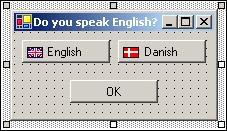
Let's move to the example. We'll create a dialog with three buttons. Two of the buttons will change the language used from English to Danish and back (feel free to use whatever language you prefer). The last button closes the dialog.
Try it Out – Button Test
1. Open Visual Studio.NET and create a new C# Windows Application. Name the
application ButtonTest.
application ButtonTest.
2. Pin the Toolbox down, and double-click the Button control three times. Then move the buttons and resize the form as shown in the picture below:
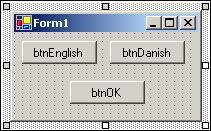 |
3. Right-click a button and select Properties. Then change the Name property for each of the buttons as indicated in the picture above by selecting the Name edit field in the Properties panel and typing the text.
4. Change the Text properties of each of the three buttons to the same as the name except for the first three letters (btn).
5. We want to display a flag in front of the text to make it clear what we are talking about. Select the English button and find the Image property. Click (…) to the right of it to bring up a dialog where you can select an image. The flag icons we want to display come with Visual Studio.NET. If you installed to the default location (on an English language installation) they should be located in C:\Program Files\Microsoft Visual Studio.NET\Common7\Graphics\icons\Flags. Select the icon flguk.ico. Repeat this process with the Danish button, selecting the flgden.ico file instead (if you want to use a different flag here, then this directory will have other flags to choose from).
6. You'll notice at this point that the button text and icon is placed on top of each other, so we need to change the alignment of the icon. For both the English and Danish buttons, change the ImageAlign property to MiddleLeft.
7. At this point, you may want to adjust the width of the buttons so that the text doesn't start right where the images end. Do this by selecting each of the buttons and pull out the right notch that appear.
8. Finally, click on the form and change the Text property to "Do you speak English?"
That's it for the user interface of our dialog. You should now have something that looks like this:
 |
Now we are ready to add the event handlers to the dialog. Double-click the English button. This will take you to directly to the event handler. The Click event is the default for the button it is that event that is created when you double-click the button. Other controls have other defaults.
Adding the Event Handlers
When you double-click the control two things happens in the code behind the form. First of all, a subscription to the event is created in the InitializeComponent() method:
this.btnEnglish.Click += new System.EventHandler(this.btnEnglish_Click);
If you want to subscribe an event other than the default one, you will need to write the subscription code yourself, as we will do in the remainder of this chapter. It is important to remember that the code in the InitializeComponent() method is overwritten every time you switch from design mode to the code. Because of this, you should never write your event subscriptions in this method. Instead, use the constructor of the class.
The second thing that happens, is that the event handler itself is added:
private void btnEnglish_Click(object sender, System.EventArgs e)
{
   this.Text = "Do you speak English?";
}
The method name is a concatenation of the name of the control, an underscore and the name of the event that is handled. The first parameter, object sender, will hold the control that was clicked. In this example, this will always be the control indicated by the name of the method, but in other cases many controls may use the same method to handle an event, and it that case you can find out exactly which control is calling by checking this value. The text box example later in this chapter demonstrates how to use a single method for multiple controls. The other parameter, System.EventArgs e, holds information about what happened. In this case, we'll not be needing any of this information.
As you will recall from earlier in this book, the this keyword identifies the current instance of the class. Because the class we are working on is represented by that instance, we can access the properties and controls it contains through that keyword. Setting the Text property on this as we do in the code above then means that we are setting the Text property of the current instance of the form.
Return to the Form Designer and double-click the Danish button and you will be taken to the event handler for that button. Here is the code:
private void btnDanish_Click(object sender, System.EventArgs e)
{
   this.Text = "Taler du dansk?";
}
This method is identical to the btnEnglish_Click, except that the text is in Danish. Finally, we add the event handler for the OK button in the same way as we've done twice now. The code is a little different though:
private void btnOK_Click(object sender, System.EventArgs e)
{
   Application.Exit();
}
With this, we exit the application and, with it, this first example. Compile it, run it, and press a few of the buttons. You will get output similar to this:
 |
The Label and LinkLabel Controls
The Label control is probably the most used control of them all. Look at any Windows application and you'll see them on just about any dialog you can find. The label is a simple control with one purpose only: to present a caption or short hint to explain something on the form to the user.
Out of the box, Visual Studio.NET includes two label controls that are able to present them selves to the user in two distinct ways:
- Label, the standard Windows label
- LinkLabel, a label like the standard one (and derived from it), but presents itself as an internet link (a hyperlink)
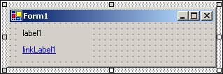
The two controls are found at the top of the control panel on the Window Forms tab. In the picture below, one of each of the two types of Label have been dragged to a to illustrate the difference in appearance between the two:
 |
If you have experience with Visual Basic you may notice that the Text property is used to set the text that is displayed, rather than the Caption property. You will find that all intrinsic .NET controls use the name Text to describe the main text for a control. Before .NET, Caption and Text were used interchangeably.
And that's it for most uses of the Label control. Usually you need to add no event handling code for a standard Label. In the case of the LinkLabel, however, some extra code is needed if you want to allow the user to click it and take him or her to the web page shown in the text.
The Label control has a surprising number of properties that can be set. Most of these are derived from Control, but some are new. The following table lists the most common ones. If nothing else is stated, the properties exist in both the Label and LinkLabel controls:
| Name | Availability | Description |
| BorderStyle | Read/Write | Allows you to specify the style of the border around the Label. The default is no border. |
| DisabledLinkColor | Read/Write | (LinkLabel only) The color of the LinkLabel after the user has clicked it. |
| FlatStyle | Read/Write | Controls how the control is displayed. Setting this property to PopUp will make the control appear flat until the user moves the mouse pointer over the control. At that time, the control will appear raised. |
| Image | Read/Write | This property allows you to specify a single image (bitmap, icon, and so on.) to be displayed in the label. |
| ImageAlign | Read/Write | (Read/Write) Where in the Label the image is shown. |
| LinkArea | Read/Write | (LinkLabel only) The range in the text that should be displayed as a link. |
| LinkColor | Read/Write | (LinkLabel only) The color of the link. |
| Links | Read only | (LinkLabel only) It is possible for a LinkLabel to contain more than one link. This property allows you to find the link you want. The control keeps track of the links displayed in the text. |
| LinkVisited | Read only | (LinkLabel only) Returns whether a link has been visited or not. |
| Text | Read/Write | The text that is shown in the Label. |
| TextAlign | Read/Write | Where in the control is the text shown. |
The TextBox Control
Text boxes should be used when you want the user to enter text that you have no knowledge of at design time (for example the name of the user). The primary function of a text box is for the user to enter text, but any characters can be entered, and it is quite possible to force the user to enter numeric values only.
Out of the box .NET comes with two basic controls to take text input from the user: TextBox and RichTextBox (we'll discuss RichTextBox later in this chapter). Both controls are derived from a base class called TextBoxBase which itself is derived from Control.
TextBoxBase provides the base functionality for text manipulation in a text box, such as selecting text, cutting to and pasting from the Clipboard, and a wide range of events. We'll not focus so much now on what is derived from where, but instead look at the simpler of the two controls first – TextBox. We'll build one example that demonstrates the TextBox properties and build on that to demonstrate the RichTextBox control later.
TextBox Properties
As has been stated earlier in this chapter, there are simply too many properties for us to describe them all, and so this listing includes only the most common ones:
| Name | Availability | Description |
| CausesValidation | Read/Write | When a control that has this property set to true is about to receive focus, two events are fired: Validating and Validated. You can handle these events in order to validate data in the control that is losing focus. This may cause the control never to receive focus. The related events are discussed below. |
| CharacterCasing | Read/Write | A value indicating if the TextBox changes the case of the text entered. The possible values are: q Lower: All text entered into the text box is converted lower case. q Normal: No changes are made to the text. q Upper: All text entered into the text box is converted to upper case. |
| MaxLength | Read/Write | A value that specifies the maximum length in characters of any text, entered into the TextBox. Set this value to zero it the maximum limit is limited only by available memory. |
| Multiline | Read/Write | Indicates if this is a multiline control. A multiline control is able to show multiple lines of text. |
| PasswordChar | Read/Write | Specifies if a password character should replace the actual characters entered into a single line textbox. If the Multiline property is true then this has no effect. |
| ReadOnly | Read/Write | A Boolean indicating if the text is read only. |
| ScrollBars | Read/Write | Specifies if a multilane text box should display scrollbars. |
| SelectedText | Read/Write | The text that is selected in the text box. |
| SelectionLength | Read/Write | The number of characters selected in the text. If this value is set to be larger than the total number of characters in the text, it is reset by the control to be the total number of characters minus the value of SelectionStart. |
| SelectionStart | Read/Write | The start of the selected text in a text box. |
| WordWrap | Read/Write | Specifies if a multiline text box should automatically wrap words if a line exceeds the width of the control. |
TextBox Events
Careful validation of the text in the TextBox controls on a form can make the difference between happy users and very angry ones.
You have probably experienced how annoying it is, when a dialog only validates its contents when you click OK. This approach to validating the data usually results in a message box being displayed informing you that the data in "TextBox number three" is incorrect. You can then continue to click OK until all the data is correct. Clearly this is not a good approach to validating data, so what can we do instead?
The answer lies in handling the validation events a TextBox control provides. If you want to make sure that invalid characters are not entered in the text box or only values within a certain range are allowed, then you will want to indocate to the user of the control whether the value engtered is valid or not.
The TextBox control provides these events (all of which are inherited from Control):
| Name | Description |
| Enter GotFocus Leave Validating Validated LostFocus | These six events occur in the order they are listed here. They are known as "Focus Events" and are fired whenever a controls focus changes, with two exceptions. Validating and Validated are only fired if the control that receives focus has the CausesValidation property set to true. The reason why it's the receiving control that fires the event is that there are times where you do not want to validate the control, even if focus changes. An example of this is if the user clicks a Help button. |
| KeyDown KeyPress KeyUp | These three events are known as "Key Events". They allow you to monitor and change what is entered into your controls. KeyDown and KeyUp receive the key code corresponding to the key that was pressed. This allows you to determine if special keys such as Shift or Control and F1 were pressed. KeyPress, on the otherhand, receives the character corresponding to a keyboard key. This means that the value for the letter "a" is not the same as the letter "A". It is useful if you want to exclude a range of characters, for example, only allowing numeric values to be entered. |
| Change | Occurs whenever the text in the textbox is changed, no matter what the change. |
Try it Out – TextBoxTest
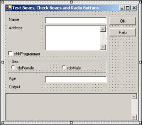
We'll create a dialog on which you can enter your name, address, occupation, and age. The purpose of this example is to give you a good grounding in manipulating properties and using events, not to create something that is incredibly useful.
We'll build the user interface first:
1. Select Files | New and create a new Windows Application under C# Projects. Name the project TextBoxTest.
2. Create the form shown below by dragging the labels, text boxes, and buttons onto the design surface. Before you can resize the two text boxes txtAddress and txtOutput as shown you must set their Multiline property to true. Do this by right-clicking the controls and select Properties:
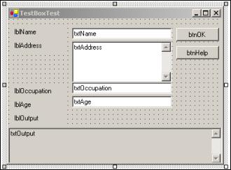 |
3. Name the controls as are indicated in the picture above.
4. Set the text property of for each of the text boxes to an empty string, which means that they will contain nothing when the application is first run.
5. Set the text property of all other controls to the same as the name of the control except for the first three letters. Set the text property of the form as indicated in the caption in the picture.
6. Set the Scrollbars property of the two controls txtOutput and txtAddress
to Vertical.
to Vertical.
7. Set the ReadOnly property of the txtOutput control to true.
8. Set the CausesValidation property of the button btnHelp to false. Remember from the discussion of the Validating and Validated events that setting this to false will allow the user to click this button without having to be convered about entering invalid data.
9. When you have sized the form to fit snugly around the controls, it is time to anchor the controls so they behave properly when the form is resized. Set the Anchor property as shown in the table below:
| Control | Anchor value |
| All Labels | Top, Bottom, Left |
| All TextBoxes | Top, Bottom, Left, Right |
| Both buttons | Top, Right |
Tip: You can copy the Anchor property text from one control and paste into the other controls with the same values. You do not need to use the drop-down button.
The reason why txtOutput is anchored rather than docked to the bottom of the form is that we want the output text area to be resized as we pull the form. If we had docked the control to the bottom of the form, it would be moved to stay at the bottom, but it would not be resized.
10. One final thing should be set. On the form, find the Size and MinSize properties. Our form has little meaning if it is sized to something smaller than it is now, therefore you should set the MinSize property to the same as the Size property.
The job of setting up the visual part of the form is now complete. If you run it nothing happens when you click the buttons or enter text, but if you maximize or pull in the dialog, the controls behave exactly as you want them to in a proper user interface, staying put and resizing to fill the whole of the dialog. If you've ever tried to accomplish the same task in a language like Visual Basic 6, you will know how much work you have just been spared.
Now it is time to look at the code. Right click on the form and select View Code. If you have the toolbox pinned, you should remove the pin to make more space for the code window.
Surprisingly little code is visible in the editor. At the top of our class, the controls are defined, but it isn't until you expand the region labeled Windows Form Designer Generated Code that you can see where all your work went. It should be stressed that you should never edit the code in this section! The next time you change something in the designer, it will be overwritten, or even worse, you could change something such that the form designer can no longer show the form.
You should take a minute to look over the statements in this section. You will see exactly why it is possible to create a Windows Application without using Visual Studio.NET. Everything in this section could simply be entered in Notepad or a similar text editor and compiled. You will also see why that is not advisable. Keeping track of everything in here is difficult at the best of times; it is easy to introduce errors and, because you cannot see the effects of what you are doing, arranging the controls on the form to look right is a cumbersome task. This does, however, open the door for third party software producers to write their own programming environments to rival Visual Studio.NET, because the compilers used to create the forms are included with the .NET framework, rather than with Visual Studio.NET.
Adding the Event Handlers
We can pull out that last bit of effort from the form designer however, before we add our own code. Go back to the Form Designer (by clicking the tab on the top of the text editor), and double-click the button btnOK. Repeat this with the other button. As we saw in the button example earlier in this chapter this causes event handlers for the click event of the buttons to be created. When the OK button is clicked, we want to transfer the text in the input text boxes to the read-only output box.
Here is the code for the two click events:
private void btnOK_Click(object sender, System.EventArgs e)
{
   // No testing for invalid values are made, as that should
   // not be necessary

   string output;

   // Concatenate the text values of the four TextBoxes
   output = "Name: " + this.txtName.Text + "\r\n";
   output += "Address: " + this.txtAddress.Text + "\r\n";
   output += "Occupation: " + this.txtOccupation.Text + "\r\n";
   output += "Age: " + this.txtAge.Text;

   // Insert the new text
   this.txtOutput.Text = output;
}

private void btnHelp_Click(object sender, System.EventArgs e)
{
   // Write a short description of each TextBox in the Output TextBox
   string output;

   output = "Name = Your name\r\n;
   output += "Address = Your address\r\n";
   output += "Occupation = Only allowed value is 'Programmer'\r\n";
   output += "Age = Your age";

   // Insert the new text
   this.txtOutput.Text = output;
}
In both functions the Text properties of the text boxes are used, either retrieved or set in the btnOK_Click() function or simply set as in the btnHelp_Click() function.
We insert the information the user has entered without bothering to check if it is correct. This means that we must do the checking elsewhere. In this example, there are a number of criteria that have to be met in order for the values to be correct:
- The name of the user cannot be empty
- The age of the user must be a number greater than or equal to zero
- The occupation of the user must be "Programmer" or be left empty
- The address of the user cannot be empty
From this we can see that the check that must be done for two of the text boxes (txtName and txtAddress) is the same. We also see that we should prevent the user from entering anything invalid into the Age box, and finally we must check if the user is a programmer.
To prevent the user from clicking OK before anything is entered, we start by setting the OK button's Enabled property to false in the constructor of our form, making sure not to set the property until after the generated code in InitializeComponent() has been called:
public Form1()
{
   //
   // Required for Windows Form Designer support
   //
   InitializeComponent();
   this.btnOK.Enabled = false;
}
Now we'll create the handler for the two text boxes that must be checked to see if they are empty. We do this by subscribing to the Validating event of the text boxes. We inform the control that the event should be handled by a method named txtBoxEmpty_Validating().
We also need a way to know the state of our controls. For this purpose, we use the Tag property of the text boxes. If you recall the discussion of this property earlier in the chapter, we said that only strings can be assigned to the Tag property from the Forms Designer. However, as we are setting the Tag value from code, we can do pretty much what we want with it, and it is more appropriate to enter a Boolean value here.
To the constructor we add the following statements:
this.btnOK.Enabled = false;

// Tag values for testing if the data is valid
this.txtAddress.Tag = false;
this.txtAge.Tag = false;
this.txtName.Tag = false;
this.txtOccupation.Tag = false;

// Subscriptions to events
this.txtName.Validating += new
       System.ComponentModel.CancelEventHandler(this.txtBoxEmpty_Validating);
this.txtAddress.Validating += new
       System.ComponentModel.CancelEventHandler(this.txtBoxEmpty_Validating);
Please see Chapter 12 for a complete explanation of events if you are not entirely comfortable with them yet.
Unlike the button event handler we've seen previously, the event handler for the Validating event is a specialized version of the standard handler, System.EventHandler. The reason this event need a special handler is that should the validating fail, there must be a way to prevent any further processing. If we were to cancel further processing, that would effectively mean that it would be impossible to leave a text box until the data entered is valid. We will not do anything as drastic as that in this example.
The Validating and Validated events combined with the CausesValidation property fixes a nasty problem that occurred when using the GotFocus and LostFocus events to perform validation of controls. The problem occurred when the GotFocus and LostFocus events were continually fired, because validation code was attempting to shift the focus between control, which created an infinite loop.
We add the event handler as follows:
private void txtBoxEmpty_Validating(object sender,
                                    System.ComponentModel.CancelEventArgs e)
{
   // We know the sender is a TextBox, so we cast the sender object to that
   TextBox tb = (TextBox)sender;

   // If the text is empty we set the background color of the
   // Textbox to red to indicate a problem. We use the tag value
   // of the control to indicate if the control contains valid
   // information.
   if (tb.Text.Length == 0)
   {
      tb.BackColor = Color.Red;
      tb.Tag = false;

      // In this case we do not want to cancel further processing,
      // but if we had wanted to do this, we would have added this line:
      // e.Cancel = true;
   }
   else
   {
      tb.BackColor = System.Drawing.SystemColors.Window;
      tb.Tag = true;
   }

   // Finally, we call ValidateAll which will set the value of
   // the OK button.
   ValidateAll();
}
Because more than one text box is using this method to handle the event, we cannot be sure which is calling the function. We do know, however, that the effect of calling the method should be the same no matter who is calling, so we can simply cast the sender parameter to a text box and work on that.
If the length of the text in the text box is zero, we set the background color to red and the tag to false. If it is not, we set the background color to the standard Windows color for a window.
You should always use the colors found in the System.Drawing.SystemColors enumeration when you want to set a standard color in a control. If you simply set the color to white, your application will look strange if the user has changed the default color settings.
The ValidateAll()function is described at the end of this example.
Keeping with the Validating event, the next handler we'll add is for the Occupation text box. The procedure is exactly the same as for the two previous handlers, but the validation code is different, because occupation must be Programmer or an empty string to be valid. We therefore, add a new line to the constructor.
this.txtOccupation.Validating += new
     System.ComponentModel.CancelEventHandler(this.txtOccupation_Validating);
And then the handler itself:
private void txtOccupation_Validating(object sender,
                                      System.ComponentModel.CancelEventArgs e)
{
   // Cast the sender object to a textbox
   TextBox tb = (TextBox)sender;

   // Check if the values are correct
   if (tb.Text.CompareTo("Programmer") == 0 || tb.Text.Length == 0)
   {
      tb.Tag = true;
      tb.BackColor = System.Drawing.SystemColors.Window;
   }
   else
   {
      tb.Tag = false;
      tb.BackColor = Color.Red;
   }

   // Set the state of the OK button
   ValidateAll();
}
Our second to last challenge is the age text box. We don't want the user to type anything but positive numbers (including 0 to make the test simpler). To achieve this we'll use the KeyPress event to remove any unwanted characters before they are shown in the text box.
First, we subscribe to the KeyPress event. We do this as we've done with the previous event handlers in the constructor:
this.txtAge.KeyPress += new
           System.Windows.Forms.KeyPressEventHandler(this.txtAge_KeyPress);
This event handler is specialized as well. The System.Windows.Forms.KeyPressEventHandler is supplied, because the event needs information about the key that was pressed.
We then add the event handler itself:
private void txtAge_KeyPress(object sender,
                             System.Windows.Forms.KeyPressEventArgs e)
{
   if ((e.KeyChar < 48 || e.KeyChar > 57) && e.KeyChar != 8)
      e.Handled = true; // Remove the character
}
The ASCII values for the characters between 0 and 9 lies between 48 and 57, so we make sure that the character is within this range. We make one exception though. The ASCII value 8 is the Backspace key, and for editing reasons, we allow this to slip through.
Setting the Handled property of KeyPressEventArgs to true tells the control that it shouldn't do anything else with the character, and so it is not shown.
As it is now, the control is not marked as invalid or valid. This is because we need another check to see if anything was entered at all. This is a simple thing as we've already written the method to perform this check, and we simply subscribe to the Validating event for the Age control as well by adding this line to the constructor:
this.txtAge.Validating += new
       System.ComponentModel.CancelEventHandler(this.txtBoxEmpty_Validating);
One last case must be handled for all the controls. If the user has entered valid text in all the textboxes and then changes something, making the text invalid, the OK button remains enabled. So we have to handle one last event handler for all of the text boxes: the Change event which will turn off the OK button should any text field contain invalid data.
The Change event is fired whenever the text in the control changes. We subscribe to the event by adding the following lines to the constructor:
this.txtName.TextChanged += new System.EventHandler(this.txtBox_TextChanged);
this.txtAddress.TextChanged += new
                                System.EventHandler(this.txtBox_TextChanged);
this.txtAge.TextChanged += new System.EventHandler(this.txtBox_TextChanged);
this.txtOccupation.TextChanged += new
                               System.EventHandler(this.txtBox_TextChanged);
The Change event uses the standard event handler we know from the Click event. Finally, we add the event itself:
private void txtBox_TextChanged(object sender, System.EventArgs e)
{
   // Cast the sender object to a Textbox
   TextBox tb = (TextBox)sender;

   // Test if the data is valid and set the tag and background
   // color accordingly.
   if (tb.Text.Length == 0 && tb != txtOccupation)
   {
      tb.Tag = false;
      tb.BackColor = Color.Red;
   }
   else if (tb == txtOccupation &&
             (tb.Text.Length != 0 && tb.Text.CompareTo("Programmer") != 0))
   {
      // Don't set the color here, as it will color change while the user
      // is typing
      tb.Tag = false;
   }
   else
   {
      tb.Tag = true;
      tb.BackColor = SystemColors.Window;
   }

   // Call ValidateAll to set the OK button
   ValidateAll();
}
This time, we must find out exactly which control is calling the event handler, because we don't want the background color of the Occupation textbox to change to red when the user starts typing. We do this by checking the Name property of the textbox that was passed to us in the sender parameter.
Only one thing remains: the ValidateAll method that enables or disables the OK button:
private void ValidateAll()
{
   // Set the OK button to enabled if all the Tags are true
   this.btnOK.Enabled = ((bool)(this.txtAddress.Tag) &&
                         (bool)(this.txtAge.Tag) &&
                         (bool)(this.txtName.Tag) &&
                         (bool)(this.txtOccupation.Tag));
}
The method simply sets the value of the Enabled property of the OK button to true if all of the Tag properties are true. We need to cast the value of the Tag properties to a Boolean, because it is stored as an object type.
If you test the program now, you should see something like this:
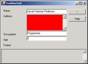 |
Notice that you can click the Help button while you are in a textbox with invalid data without the background color changing to red.
The example we've just completed is quite long compared to the others you will see in this chapter. This is because we'll build on this example rather than inventing the wheel.
Remember you can download the source code for the examples in this book from www.wrox.com.
The RadioButton and CheckBox Controls
As mentioned earlier, the RadioButton and CheckBox controls share their base class with the button control, though their appearance and use differs substantially from the button.
Radio buttons traditionally displays themselves as a label with a dot to the left of it, which can be either selected or not. You should use the radio buttons when you want to give the user a choice between several mutually exclusive options. An example of this could be, if you want to ask for the gender of the user.
To group radio boxes together so that they create one logical unit you must use a GroupBox control. By first placing a group box on a form, and then placing the RadioButton controls you need within the borders of the group box, the RadioButton controls will know to change their state to reflect that only one within the group box can be selected. If you do not place them within a group box, only one RadioButton on the form can be selected at any given time.
A CheckBox traditionally displays itself as a label with a small box with a checkmark to the left of it. You should use the check box when you want to allow the user to choose one or more options. An example could be a questionnaire asking which operating systems the user has tried (for example, Windows 95, Windows 98, Linux, Max OS X, and so on.)
We'll look at the important properties and events of the two controls, starting with the RadioButton, and then move on to a quick example of their use.
RadioButton Properties
As the control derives from ButtonBase and we've already seen in our example that used the button earlier, there are only a few properties to describe. As always, should you need a complete list, please refer to the MSDN library:
| Name | Availability | Description |
| Appearance | Read/Write | A RadioButton can be displayed either as a label with a circular check to the left, middle or right of it, or as a standard button. When it is displayed as a button, the control will appear pressed when selected and 3D otherwise. |
| AutoCheck | Read/Write | When this property is true, a check mark is displayed when the user clicks the radio button. When it is false, the check mark is not displayed by default. |
| CheckAlign | Read/Write | By using this property, you can change the alignment of the radio button. It can be left, middle, and right. |
| Checked | Read/Write | Indicates the status of the control. It is true if the control has a check mark, and false otherwise. |
RadioButton Events
You will usually only use one event when working with RadioButtons, but as always there many others that can be subscribed to. We'll only cover two in this chapter, and the only reason the second event is mentioned is, that there is a subtle difference between the two that should be noted:
| Name | Description |
| CheckChanged | This event is sent when the check of the RadioButton changes. If there is more than one RadioButton control on the form or within a group box, this event will be sent twice, first to the control, which was checked and now becomes unchecked, then to the control which becomes checked. |
| Click | This event is sent every time the RadioButton is clicked. This is not the same as the change event, because clicking a RadioButton twice or more times in succession only changes the checked property once – and only if it wasn't checked already. |
CheckBox Properties
As you would imagine, the properties and events of this control is very similar to those of the RadioButton, but there are two new ones:
| Name | Availability | Description |
| CheckState | Read/Write | Unlike the RadioButton, a CheckBox can have three states: Checked, Indeterminate, and Unchecked. When the state of the check box is Indeterminate, the control check next to the label is usually grayed, indicating that the current value of the check is not valid or has no meaning under the current circumstances. An example of this state can be seen if you select several files in the Windows Explorer and look at their properties. If some files are readonly and others are not, the readonly checkbox will be checked, but greyed – indeterminate. |
| ThreeState | Read/Write | When this property is false, the user will not be able to change the CheckBox' state to Indeterminate. You can, however, still change the state of the check box to Indeterminate from code. |
CheckBox Events
You will normally use only one or two events on this control. Note that, even though the CheckChanged event exists on both the RadioButton and the CheckBox controls, the effects of the events differ:
| Name | Description |
| CheckedChanged | Occurs whenever the Checked property of the check box changes. Note that in a CheckBox where the ThreeState property is true, it is possible to click the check box without changing the Checked property. This happens when the check box changes from checked to indeterminate state. |
| CheckedStateChanged | Occurs whenever the CheckedState property changes. As Checked and Unchecked are both possible values of the CheckedState property, this event will be sent whenever the Checked property changes. In addition to that, it will also be sent when the state changes from Checked to Indeterminate. |
This concludes the events and properties of the RadioButton and CheckBox controls. But before we look at an example using these, let's take a look at the GroupBox control which we mentioned earlier.
The GroupBox Control
Before we move on to the example, we'll look at the group box control. This control is often used in conjunction with the RadioButton and CheckBox controls to display a frame around, and a caption above, a series of controls that are logically linked in some way.
Using the group box is as simple as dragging it onto a form, and then dragging the controls it should contain onto it (but not the other way round – you can't lay a group box over some pre-exisiting controls). The effect of this is that the parent of the controls becomes the group box, rather than the form, and it is therefore possible to have more than one RadioButton selected at any given time. Within the group box, however, only one RadioButton can be selected.
The relationship between parent and child probably need to be explained a bit more. When a control is placed on a form, the form is said to become the parent of the control, and hence the control is the child of the form. When you place a GroupBox on a form, it becomes a child of a form. As a group box can itself contain controls, it becomes the parent of these controls. The effect of this is that moving the GroupBox will move all of the controls placed on it.
Another effect of placing controls on a group box, is that it allows you to change certain properties of all the controls it contains simply by setting the corresponding property on the group box. For instance, if you want to disable all the controls within a group box, you can simply set the Enabled property of the group box to false.
We will demonstrate the use of the GroupBox in the following example.
Try it Out – RadioButton and CheckBox Example
We'll modify the example we used when we demonstrated the use of text boxes. In that example, the only possible occupation was Programmer. Instead of forcing the user to write this if he or she is a programmer, we'll change this text box to a check box.
To demonstrate the use of the RadioButton, we'll ask the user to provide one more piece of information: his or her gender.
Change the text box example like this:
1. Remove the label named lblOccupation and the text box named txtOccupation.
2. Resize the form in order to fit a group box with the information about the users sex onto it, and name the new controls as shown in the picture below:
 |
3. The text of the RadioButton and CheckBox controls should be the same as the names of the controls without the first three letters.
4. Set the Checked property of the chkProgrammer check box to true.
5. Set the Checked property of either rdoMale or rdoFemale to true. Note that you cannot set both to true. If you try to, the value of the other RadioButton is automatically changed to false.
No more needs to be done on the visual part of the example, but there are a number of changes in the code. First, we need to remove all our reference to the text box that has been removed. Go to the code and complete the following steps.
6. In the constructor of the form, remove the two lines which refer to txtOccupation. This includes subscriptions to the Validating and TextChanged events and the line, which sets the tag of the txtBox to false.
7. Remove the methodtxtOccupation_Validating entirely.
This example can be found in the code download for this chapter as the RadioButtonAndCheckBox Visual Studio.NET project.
Adding the Event Handlers
The txtBox_TextChanged method included tests to see if the calling control was the txtOccupation TextBox. We now know for sure that it will not be, and so we change the method by removing the elseif block and modify the if test as follows:
private void txtBox_TextChanged(object sender, System.EventArgs e)
{
   // Cast the sender object to a Textbox
   TextBox tb = (TextBox)sender;

   // Test if the data is valid and set the tag background
   // color accordingly.
   if (tb.Text.Length == 0)
   {
      tb.Tag = false;
      tb.BackColor = Color.Red;
   }
   else
   {
      tb.Tag = true;
      tb.BackColor = SystemColors.Window;
   }

   // Call ValidateAll to set the OK button
   ValidateAll();
}
The last place in which we check the value of the text box we've removed is in the ValidateAll() method. Remove the check entirely so the code becomes:
private void ValidateAll()
{
   // Set the OK button to enabled if all the Tags are true
   this.btnOK.Enabled = ((bool)(this.txtAddress.Tag) &&
      (bool)(this.txtAge.Tag) &&
      (bool)(this.txtName.Tag));
}
Since we are using a check box rather than a text box we know that the user cannot enter any invalid information, as he or she will always be either a programmer or not.
We also know that the user is either male or female, and because we set the property of one of the RadioButtons to true, the user is prevented from choosing an invalid value. Therefore, the only thing left to do is change the help text and the output. We do this in the button event handlers:
private void btnHelp_Click(object sender, System.EventArgs e)
{
   // Write a short descrption of each TextBox in the Output TextBox
   string output;

   output = "Name = Your name\r\n";
   output += "Address = Your address\r\n";
   output += "Programmer = Check 'Programmer' if you are a programmer\r\n";
   output += "Sex = Choose your sex\r\n";
   output += "Age = Your age";

   // Insert the new text
   this.txtOutput.Text = output;
}
Only the help text is changed, so nothing surprising in the help method. It gets slightly more interesting in the OK method:
private void btnOK_Click(object sender, System.EventArgs e)
{
   // No testing for invalid values are made, as that should
   // not be neccessary

   string output;

   // Concatenate the text values of the four TextBoxes
   output = "Name: " + this.txtName.Text + "\r\n";
   output += "Address: " + this.txtAddress.Text + "\r\n";
   output += "Occupation: " + (string)(this.chkProgrammer.Checked ?
            "Programmer" : "Not a programmer") + "\r\n";
   output += "Sex: " + (string)(this.rdoFemale.Checked ? "Female" :
                                                         "Male") + "\r\n";
   output += "Age: " + this.txtAge.Text;

   // Insert the new text
   this.txtOutput.Text = output;
}
The first of the new lines, which are highlighted, is the line in which the occupation of the user is printed. We investigate the Checked property of the check box, and if it is true, we write the string Programmer. If it is false, we write Not a programmer.
The second line examines only the radio button rdoFemale. If the Checked property is true on that control, we know that the user is female. If it is false we know that the user is male. Because there are only two options here, we do not need to check the other radio button, because its Checked property will always be the opposite of the first radio button.
Had we used more than two radio buttons, we would have had to loop through all of them, until we found one on which the Checked property was true.
When you run the example now, you should be able to get a result similar to this:
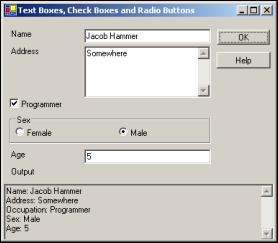 |
The RichTextBox Control
Like the normal TextBox, the RichTextBox control is derived from TextBoxBase. Because of this, it shares a number of features with the TextBox, but is much more diverse. Where a TextBox is commonly used with the purpose of obtaining short text strings from the user, the RichTextBox is used to display and enter formatted text (for example bold, underline, and italic). It does so using a standard for formatted text called Rich Text Format or RTF.
In the previous example, we used a standard TextBox. We could just as well have used a RichTextBox to do the job. In fact, as we'll see in the example later, you can remove the TextBox name txtOutput and insert a RichTextBox in its place with the same name, and the example behaves exactly as it did before.
RichTextBox Properties
If this kind of textbox is more advanced than the one we explored in the previous section, you'd expect there are new properties that can be used, and you'd be correct. Here are descriptions of the most commonly used properties of the RichTextBox:
| Name | Availability | Description |
| CanRedo | Read only | This property is true if something has been undone, that can be reapplied, otherwise false. |
| CanUndo | Read only | This property is true if it is possible to perform an undo action on the RichTextBox, otherwise it is false. |
| RedoActionName | Read only | This property holds the name of an action that be used to redo something that has been undone in the RichTextBox. |
| DetectUrls | Read/Write | Set this property to true to make the control detect URLs and format them (underline as in a browser). |
| Rtf | Read/Write | This corresponds to the Text property, except that this holds the text in RTF. |
| SelectedRtf | Read/Write | Use this property to get or set the selected text in the control, in RTF. If you copy this text to another application, for example, MS Word, it will retain all formatting. |
| SelectedText | Read/Write | Like SelectedRtf you can use this property to get or set the selected text. Unlike the RTF version of the property however, all formatting is lost. |
| SelectionAlignment | Read/Write | This represents the alignment of the selected text. It can be Center, Left, or Right. |
| SelectionBullet | Read/Write | Use this property to find out if the selection is formatted with a bullet in front of it, or use it to insert or remove bullets. |
| BulletIndent | Read/Write | Use this property to specify the number of pixels a bullet should be indented. |
| SelectionColor | Read/Write | Allow you to change the color of the text in the selection. |
| SelectionFont | Read/Write | Allow you to change to font of the text in the selection. |
| SelectionLength | Read/Write | Using this property, you either set or retrieve the length of a selection. |
| SelectionType | Read only | This property holds information about the selection. It will tell you if one or more OLE objects are selected or if only text is selected. |
| ShowSelectionMargin | Read/Write | If you set this property to true, a margin will be shown at the left of the RichTextBox. This will make it easier for the user to select text. |
| UndoActionName | Read only | Gets the name of the action that will be used if the user chooses to undo something. |
| SelectionProtected | Read/Write | You can specify that certain parts of the text should not be changed by setting this property to true. |
As you can see from the listing above, most of the new properties have to do with a selection. This is because, any formatting you will be applying when a user is working on his or her text will probably be done on a selection made by that user. In case no selection is made, the formatting will start from the point in the text where the cursor is located, called the insertion point.
RichTextBox Events
Most of the events used by the RichTextBox are the same as those used by the TextBox. There are a few new of interest though:
| Name | Description |
| LinkedClick | This event is sent when a user clicks on a link within the text. |
| Protected | This event is sent when a user attempts to modify text that has been marked as protected. |
| SelectionChanged | This event is sent when the selection changes. If for some reason you don't want the user to change the selection, you can prevent the change here. |
Try it Out – RichTextBox Example
We'll create a very basic text editor in this example. It demonstrates how to change basic formatting of text and how to load and save the text from the RichTextBox. For the sake of simplicity, the example loads from and saves to a fixed file.
As always, we'll start by designing the form:
1. Create a new C# Windows Application project and name it RichTextBoxTest.
2. Create the form as shown in the picture below. The textbox named txtSize should be a TextBox control. The textbox named rtfText should be a RichTextBox control:
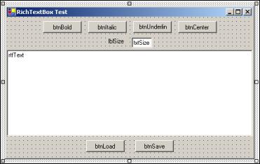 |
3. Name the controls as indicated in the picture above and clear the Text property of both rtfText and txtSize.
4. Excluding the text boxes, set the Text of all controls to the same as the names except for the first three letters.
5. Change the Text property of the txtSize text box to 10.
6. Anchor the controls as in the following table:
| Control name | Anchor value |
| btnLoad and btnSave | Bottom |
| RtfText | Top, Left, Bottom, Right |
| All others | Top |
7. Set the MinimumSize property of the form to the same as the Size property.
Adding the Event Handlers
That concludes the visual part of the example and we'll move straight to the code. Double-click the Bold button to add the Click event handler to the code. Here is the code for the event:
private void btnBold_Click(object sender, System.EventArgs e)
{
   Font oldFont;
Font newFont;

   // Get the font that is being used in the selected text
   oldFont = this.rtfText.SelectionFont;

   // If the font is using bold style now, we should remove the
   // Formatting
   if (oldFont.Bold)
      newFont = new Font(oldFont, oldFont.Style & ~FontStyle.Bold);
   else
      newFont = new Font(oldFont, oldFont.Style | FontStyle.Bold);

   // Insert the new font and return focus to the RichTextBox
   this.rtfText.SelectionFont = newFont;
   this.rtfText.Focus();
}
We start by getting the font which is being used in the current selection and assigning it to a local variable. Then we check if this selection is already bold. If it is, we want to remove the bold setting; otherwise we want to set it. We create a new font using the oldFont as the prototype, but add or remove the bold style as needed.
Finally, we assign the new font to the selection and return focus to the RichTextBox.
See Chapter 16 for a description of the Font object.
The event handlers for btnItalic and btnUnderline are the same as the above one, except we are checking the appropriate styles. Double-click the two buttons Italic and Underline and add this code:
private void btnItalic_Click(object sender, System.EventArgs e)
{
   Font oldFont;
   Font newFont;

   // Get the font that is being used in the selected text
   oldFont = this.rtfText.SelectionFont;

   // If the font is using Italic style now, we should remove it
   if (oldFont.Italic)
      newFont = new Font(oldFont, oldFont.Style & ~FontStyle.Italic);
   else
      newFont = new Font(oldFont, oldFont.Style | FontStyle.Italic);

   // Insert the new font
   this.rtfText.SelectionFont = newFont;
   this.rtfText.Focus();
}

private void btnUnderline_Click(object sender, System.EventArgs e)
{
   Font oldFont;
   Font newFont;
   // Get the font that is being used in the selected text
   oldFont = this.rtfText.SelectionFont;

   // If the font is using Underline style now, we should remove it
   if (oldFont.Underline)
      newFont = new Font(oldFont, oldFont.Style & ~FontStyle.Underline);
   else
      newFont = new Font(oldFont, oldFont.Style | FontStyle.Underline);

   // Insert the new font
   this.rtfText.SelectionFont = newFont;
   this.rtfText.Focus();
}
Double-click the last of the formatting buttons, Center, and add the following code:
private void btnCenter_Click(object sender, System.EventArgs e)
{
   if (this.rtfText.SelectionAlignment == HorizontalAlignment.Center)
      this.rtfText.SelectionAlignment = HorizontalAlignment.Left;
   else
      this.rtfText.SelectionAlignment = HorizontalAlignment.Center;
   this.rtfText.Focus();
}
Here we must check another property, SelectionAlignment to see if the text in the selection is already centered. HorizontalAlignment is an enumeration which can be Left, Right, Center, Justify, and NotSet. In this case, we simply check if Center is set, and if it is, we set the alignment to left. If it isn't we set it to Center.
The final formatting our little text editor will be able to perform is setting the size of text. We'll add two event handlers for the textbox Size, one for controlling the input, and one to detect when the user has finished enering a value.
Add the following lines to the constructor of the form:
public Form1()
{
   InitializeComponent();

   // Event Subscription
   this.txtSize.KeyPress += new
      System.Windows.Forms.KeyPressEventHandler(this.txtSize_KeyPress);
   this.txtSize.Validating += new
      System.ComponentModel.CancelEventHandler(this.txtSize_Validating);
}
We saw these two event handlers in the previous example. Both of the events use a helper method called ApplyTextSize, which takes a string with the size of the text:
private void txtSize_KeyPress(object sender,
                              System.Windows.Forms.KeyPressEventArgs e)
{
   // Remove all characters that are not numbers, backspace and enter
   if ((e.KeyChar < 48 || e.KeyChar > 57) &&
                                          e.KeyChar != 8 && e.KeyChar != 13)
   {
      e.Handled = true;
   }
   else if (e.KeyChar == 13)
   {
      // Apply size if the user hits enter
      TextBox txt = (TextBox)sender;

      if (txt.Text.Length > 0)
         ApplyTextSize(txt.Text);
      e.Handled = true;
      this.rtfText.Focus();
   }
}

private void txtSize_Validating(object sender,
                                System.ComponentModel.CancelEventArgs e)
{
   TextBox txt = (TextBox)sender;

   ApplyTextSize(txt.Text);
   this.rtfText.Focus();
}

private void ApplyTextSize(string textSize)
{
   // Convert the text to a float because we'll be needing a float shortly
   float newSize = Convert.ToSingle(textSize);
   FontFamily currentFontFamily;
   Font newFont;

   // Create a new font of the same family but with the new size
   currentFontFamily = this.rtfText.SelectionFont.FontFamily;
   newFont = new Font(currentFontFamily, newSize);

   // Set the font of the selected text to the new font
   this.rtfText.SelectionFont = newFont;
}
The work we are interested in takes place in the helper method ApplyTextSize. It starts by converting the size from a string to a float. We've prevented the user from entering anything but integers, but when we create the new font, we need a float, so convert it to the correct type.
After that, we get the family to which the font belongs and we create a new font from that family with the new size. Finally, we set the font of the selection to the new font.
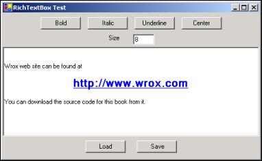
That's all the formatting we can do, but some is handled by the RichTextBox itself. If you try to run the example now, you will be able to set the text to bold, italic, and underline, and you can center the text. That is what you expect, but there is something else that is interesting. Try to type a web address, for example www.wrox.com in the text. The text is recognized by the control as an Internet address, is underlined and the mouse pointer changes to a hand when you move it over the text. If that leads you to believe that you can click it and be brought to the page, you are almost correct. We need to handle the event that is sent when the user clicks a link: LinkClicked.
We do this by subscribing to the event as we are now used to doing, in the constructor:
this.rtfText.LinkClicked += new
      System.Windows.Forms.LinkClickedEventHandler(this.rtfText_LinkedClick);
We haven't seen this event handler before. It is used to provide the text of the link that was clicked. The handler is surprisingly simple and looks like this:
private void rtfText_LinkedClick(object sender,
                                 System.Windows.Forms.LinkClickedEventArgs e)
{
   System.Diagnostics.Process.Start(e.LinkText);
}
This code opens the default browser if it isn't open already and navigates to the site to which the link that was clicked is pointing.
The editing part of the application is now done. All that remains is to load and save the contents of the control. We'll use a fixed file to do this.
Double-click the Load button, and add the following code:
private void btnLoad_Click(object sender, System.EventArgs e)
{
   // Load the file into the RichTextBox
   try
   {
      rtfText.LoadFile("../../Test.rtf");
   }
   catch (System.IO.FileNotFoundException)
   {
      MessageBox.Show("No file to load yet");
   }
}
That's it! Nothing else has to be done. Because we are dealing with files, there is always a chance that we might encounter exceptions, and we have to handle these. In the Load method we handle the exception that is thrown if the file doesn't exist. It is equally simple to save the file. Double-click the Save button and add this:
private void btnSave_Click(object sender, System.EventArgs e)
{
   // Save the text
   try
   {
      rtfText.SaveFile("../../Test.rtf");
   }
   catch (System.Exception err)
   {
      MessageBox.Show(err.Message);
   }
}
Run the example now, format some text, and click Save. Clear the textbox and click Load and the text you just saved should reappear.
This concludes the RichTextBox example. When you run it, you should be able to produce something like this:
 |
The ListBox and CheckedListBox Controls
List boxes are used to show a list of strings from which one or more can be selected at a time. Just like check boxes and radio buttons, the list box provides a means of asking the user to make one or more selections. You should use a list box when at design time you don't know the actual number of values the user can choose from (an example could be a list of co-workers). Even if you know all the possible values at design time, you should consider using a list box if there are a great number of values.
The ListBox class is derived from the ListControl class, which provides the basic functionality for the two list-type controls that come out-of-the-box with Visual Studio.NET. The other control, the ComboBox, is discussed later in this chapter.
Another kind of list box is provided with Visual Studio.NET. This is called CheckedListBox and is derived from the ListBox class. It provides a list just like the ListBox, but in addition to the text strings it provide a check for each item in the list.
ListBox Properties
In the list below all the properties exist in both the ListBox class and CheckedListBox class unless explicitly stated:
| Name | Avaliability | Description |
| SelectedIndex | Read/Write | This value indicates the zero-based index of the selected item in the list box. If the list box can contain multiple selections at the same time, this property holds the index of the first item in the selected list. |
| ColumnWidth | Read/Write | In a list box with multiple columns, this property specifies the width of the columns. |
| Items | Read-only | The Items collection contains all of the items in the list box. You use the properties of this collection to add and remove items. |
| MultiColumn | Read/Write | A list box can have more than one column. Use this property the get or set the number of columns in the list box. |
| SelectedIndices | Read-only | This property is a collection, which holds all of the zero-based indices of the selected items in the list box. |
| SelectedItem | Read/Write | In a list box where only one item can be selected, this property contains the selected item if any. In a list box where more than one selection can be made, it will contain the first of the selected items. |
| SelectedItems | Read-only | This property is a collection, which contains all of the items currently selected. |
| SelectionMode | Read/Write | You can choose between four different modes of selection in a list box: q None: No items can be selected. q One: Only one item can be selected at any time. q MultiSimple: Multiple items can be selected. q MultiExtended: Multiple items can be selected and the user can use the Ctrl, Shift and arrows keys to make selections. |
| Sorted | Read/Write | Setting this property to true will cause the ListBox to sort the items it contains alphabetically. |
| Text | Read/Write | We've seen Text properties on a number of controls, but this one works very differently than any we've seen so far. If you set the Text property of the list box control, it searches for an item that matches the text, and selects it. If you get the Text property, the value returned is the first selected item in the list. This property cannot be used if the SelectionMode is None. |
| CheckedIndicies | Read-only | (CheckedListBox only) This property is a collection, which contaisn all indexes in the CheckedListBox that is a checked or indeterminate state. |
| CheckedItems | Read-only | (CheckedListBox only) This is a collection of all the items in a CheckedListBox that are in a checked or indeterminate state. |
| CheckOnClick | Read/Write | (CheckedListBox only) If this property is true, an item will change its state whenever the user clicks it. |
| ThreeDCheckBoxes | Read/Write | (CheckedListBox only) You can choose between CheckBoxes that are flat or normal by setting this property. |
ListBox Methods
In order to work efficiently with a list box, you should know a number of methods that can be called. The following table lists the most common methods. Unless indicated, the methods belong to both the ListBox and CheckedListBox classes:
| Name | Description |
| ClearSelected | Clears all selections in the ListBox, |
| FindString | Finds the first string in the ListBox beginning with a string you specify for example FindString("a") will find the first string in the ListBox beginning with 'a' |
| FindStringExact | Like FindString but the entire string must be matched |
| GetSelected | Returns a value that indicates whether an item is selected |
| SetSelected | Sets or clears the selection of an item |
| ToString | Returns the currently selected item |
| GetItemChecked | (CheckedListBox only) Returns a value indicating if an item is checked or not |
| GetItemCheckState | (CheckedListBox only) Returns a value indicating the check state of an item |
| SetItemChecked | (CheckedListBox only) Sets the item specified to a checked stat |
| SetItemCheckState | (CheckedListBox only) Sets the check state of an item |
ListBox Events
Normally, the events you will want to be aware of when working with list boxes and CheckedListBoxes are those that have to do with the selections that are being made by the user:
| Name | Description |
| ItemCheck | (CheckedListBox only) Occurs when the check state of one of the list items changes |
| SelectedIndexChanged | Occurs when the index of the selected item changes |
Try it Out – ListBox Example
We will create a small example with both a ListBox and a CheckedListBox. The user can check items in the CheckedListBox and then click a button which will move the checked items to the normal ListBox. We create the dialog as follows:
1. Open a new project in Visual Studio.NET called Lists. Add a ListBox, a CheckedListBox and a button to the form and change the names as shown in the picture below:
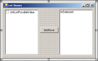 |
2. Change the Text property of the button to "Move".
3. Change the CheckOnClick property of the CheckedListBox to true.
Adding the Event Handlers
Now we are ready to add some code. When the user clicks the Move button, we want to find the items that are checked, and copy Those into the Selected List Box.
Double-click the button and enter this code:
private void btnMove_Click(object sender, System.EventArgs e)
{
   // Check if there are any checked items in the CheckedListBox
   if (this.chkListPossibleValues.CheckedItems.Count > 0)
   {
      // Clear the ListBox we'll move the selections to
      this.lstSelected.Items.Clear();

      // Loop through the CheckedItems collection of the CheckedListBox
      // and add the items in the Selected ListBox
      foreach (string item in this.chkListPossibleValues.CheckedItems)
      {
         this.lstSelected.Items.Add(item.ToString());
      }

      // Clear all the checks in the CheckedListBox
      for (int i = 0; i < this.chkListPossibleValues.Items.Count; i++)
         this.chkListPossibleValues.SetItemChecked(i, false);
   }
}
We start by checking the Count property of the CheckedItems collection. This will be greater than zero if any items in the collection are checked. We then clear all items in the Selected list box, and loop through the CheckedItems collection, adding each item to the Selected list box. Finally, we remove all the checks in the CheckedListBox.
Now we just need something in the CheckedListBox to move. We could add the items while in design mode, by selecting the Items property in the property panel and adding the items there. Instead, we'll add the items through code. We do so in the constructor of our form:
public Form1()
{
   //
   // Required for Windows Form Designer support
   //
   InitializeComponent();

   // Fill the CheckedListBox
   this.chkListPossibleValues.Items.Add("One");
   this.chkListPossibleValues.Items.Add("Two");
   this.chkListPossibleValues.Items.Add("Three");
   this.chkListPossibleValues.Items.Add("Four");
   this.chkListPossibleValues.Items.Add("Five");
   this.chkListPossibleValues.Items.Add("Six");
   this.chkListPossibleValues.Items.Add("Seven");
   this.chkListPossibleValues.Items.Add("Eight");
   this.chkListPossibleValues.Items.Add("Nine");
   this.chkListPossibleValues.Items.Add("Ten");
}
Just as you would do if you were to enter the values through the properties panel, you use the Items collection to add items at runtime.
This concludes the list box example, and if you run it now, you will get something like this:
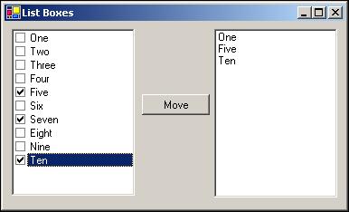 |
The ComboBox Control
As the name implies, a combo box combines a number of controls, to be specific the TextBox, Button, and ListBox controls. Unlike the ListBox, it is never possible to select more than one item in the list of items contained in a ComboBox and it is optionally possible to type new entries in the list in the TextBox part of the ComboBox.
Commonly, the ComboBox control is used to save space on a dialog because the only part of the combo box that is permanently visible are the text box and button parts of the control. When the user clicks the arrow button to the right of the text box, a list box unfolds in which the user can make a selection. As soon as he or she does so, the list box disappears and the display returns to normal.
We will now look at the properties and events of the control and then create an example that uses the ComboBox and the two ListBox controls.
ComboBox Properties
Because a ComboBox control includes tnhe features of TextBox and ListBox controls, many of the properties of the control can also be found on the two other controls. Because of that, there are a large number of properties and events on the ComboBox, and we will only cover the most common of them here. For a complete list, please refer to the MSDN library:
| Name | Availability | Description |
| DropDownStyle | Read/Write | A combo box can be displayed with three different styles: q DropDown: The user can edit the text box part of the control, and must click the arrow button to display the list part of the control. q Simple: Same as DropDown, except that the list part of the control is always visible, much like a normal ListBox. q DropDownList: The user cannot edit the text box part of the control, and must click the arrow button to display the list part of the control. |
| DroppedDown | Read/Write | Indicates whether the list part of the control is dropped down or not. If you set this property to true, the list will unfold. |
| Items | Read-only | This property is a collection, which contains all the items in the list contained in the combo box. |
| MaxLength | Read/Write | By setting this property to anything other than zero, you control the maximum number of characters it is possible to enter into the text box part of the control. |
| SelectedIndex | Read/Write | Indicates the index of the currently selected item in the list. |
| SelectedItem | Read/Write | Indicates the item that is currently selected in the list. |
| SelectedText | Read/Write | Represents the text that is selected in the text box part of the control. |
| SelectionStart | Read/Write | In the text box part of the control, this property represents the index of the first character that is selected. |
| SelectionLength | Read/Write | The length of the text selected in the text box part of the control. |
| Sorted | Read/Write | Set this property to true to make the control sort the items in the list portion alphabetically. |
| Text | Read/Write | If you set this property to null, any selection in the list portion of the control is removed. If you set it to a value, which exists in the list part of the control, that value is selected. If the value doesn't exist in the list, the text is simply shown in the text portion. |
ComboBox Events
There are three main actions that you will want to be notified when happens on a combo box:
- The selection changes
- The drop down state changes
- The text changes
To handle these three actions you will normally subscribe to one or more of the following events:
| Name | Description |
| DropDown | Occurs when the list portion of the control is dropped down. |
| SelectedIndexChanged | Occurs when the selection in the list portion of the control changed. |
| KeyDown KeyPress KeyUp | These events occur when a key is pressed while the text portion of the control has focus. Please refer to the descriptions of the events in the text box section earlier in this chapter. |
| TextChanged | Occurs when the Text property changes |
Try it Out – ComboBox Example
Once again, we'll revisit the example used in the TextBox example. Recall that in the CheckBoxes example, we changed the occupation TextBox to a CheckBox. It should be noted that it is possible to have an occupation other than programmer, and so we should change the dialog once again to accommodate more occupations. To do this, we'll use a combo box which will contain two occupations: consultant and programmer and allow the user to add his or her own occupation in the TextBox should that be different
Because the user should not have to manually enter his or her occupation every time he or she uses our application, we'll save the items in the ComboBox to a file every time the dialog closes, and load it when it starts.
Let's start with the changes to the dialogs appearance:
1. Remove the CheckBox named chkProgrammer.
2. Add a label and a ComboBox and name them as shown in the picture below:
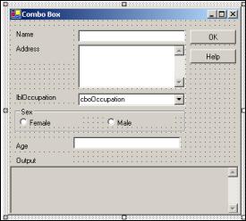 |
3. Change the Text property of the label to Occupation and clear it on the ComboBox.
4. No more changes need to be done on the form. However, create a text file named Occupations.txt with the following two lines:
Consultant
Programmer
This example can be found in the code download for this chapter as the ComboBox Visual Studio.NET project.
Adding the Event Handlers
Now we are ready to change the code. Before we start writing new code, we'll change the btnOK_Click event handler to match the changes ot the form:
private void btnOK_Click(object sender, System.EventArgs e)
{
   // No testing for invalid values are made, as that should
   // not be neccessary

   string output;

   // Concatenate the text values of the controls
   output = "Name: " + this.txtName.Text + "\r\n";
   output += "Address: " + this.txtAddress.Text + "\r\n";
   output += "Occupation: " + this.cboOccupation.Text + "\r\n";


   output += "Sex: " + (string)(this.rdoFemale.Checked ? "Female" : "Male") +
             "\r\n";
   output += "Age: " + this.txtAge.Text;

   // Insert the new text
   this.txtOutput.Text = output;
}
Instead of the check box, we're now using a combo box, so when an item is selected in a combo box, it is shown in the editable portion of the control. Because of that, the value we are interested in will always be in the Text property of the combo box.
Now we are ready to start writing new code. The first thing that we'll do, is to create a method that loads the values that already exist in the file and inserts them into the combo box:
private void LoadOccupations()
{
   try
   {
      // Create a StreamReader object. Change the path to where you put
      // the file
      System.IO.StreamReader sr =
                   new System.IO.StreamReader("../../Occupations.txt");

      string input;

      // Read as long as there are more lines
      do
      {
         input = sr.ReadLine();

         // Add only if the line read contains any characters
         if (input != "")
            this.cboOccupation.Items.Add(input);
      } while (sr.Peek() != -1);
                             // Peek returns -1 if at the end of the stream

      // Close the stream
      sr.Close();
   }
   catch (System.Exception)
   {
      MessageBox.Show("File not found");
   }
}
The stream reader is covered in Chapter 20, so we won't discuss the intricacies of this code here. Suffice to say, we use it to open the text file Occupations.txt and read the items for the combo box one line at the time. We add each line in the file to the combo box by using the Add() method on the Items collection.
As the user should be able to enter new items into the combo box, we'll add a check for the Enter key being pressed. If the text in the Text property of the ComboBox does not exist in the Items collection, we'll add the new item to it:
private void cboOccupation_KeyDown(object sender,
                                   System.Windows.Forms.KeyEventArgs e)
{
   int index = 0;
   ComboBox cbo = (ComboBox)sender;

   // We only want to do something if the enter key was pressed
   if (e.KeyCode == Keys.Enter)
   {
      // FindStringExact searches for the string and is not
      // case-sensitive, which
      // is exactly what we need, as Programmer and programmer is the same.
      // If we find a match we'll move the selection in the ComboBox to
      // that item.
      index = cbo.FindStringExact(cbo.Text);
      if (index < 0) // FindStringExact return -1 if nothing was found.
         cbo.Items.Add(cbo.Text);
      else
         cbo.SelectedIndex = index;

      // Signal that we've handled the key down event
      e.Handled = true;
   }
}
The FindStringExact() method of the ComboBox object searches for a string that is an exact match no matter the case of either of the strings. This is perfect for us, because we don't want to add the same occupation in a variety of cases to the collection.
If we don't find an item in the Items collection that matches the text, we add a new item. Adding a new item automatically sets the currently selected item to the new one. If we find a match, we simply select the existing entry in the collection.
We also need to subscribe to the event, which we do in the constructor of the form:
this.txtAge.TextChanged += new System.EventHandler(this.txtBox_TextChanged);
this.cboOccupation.KeyDown += new
           System.Windows.Forms.KeyEventHandler(this.cboOccupation_KeyDown);
When the user closes the dialog, we should save the items in the combo box. We do that in
another method:
another method:
private void SaveOccupation()
{
   try
   {
      System.IO.StreamWriter sw = new
                         System.IO.StreamWriter("../../Occupations.txt");
   foreach (string item in this.cboOccupation.Items)
      sw.WriteLine(item); // Write the item to the file
   sw.Flush();
   sw.Close();
   catch (System.Exception)
   {
      MessageBox.Show("File not found or moved");
   }
}
The StreamWriter class is covered in Chapter 20 and so the details of this code won't be discussed. However, once again we wrap the file IO code in a try...catch block as a precaution just in case someone inadvertently deletes or moves the text file while the form is open. We loop through the items in the Items collection and write each one to the file.
Finally, we must call the LoadOccupation() and SaveOccupation() methods we have just defined. We do so in the form constructor and Dispose() methods respectively:
public Form1()
{
   .
   .
   .
   this.cboOccupation.KeyDown += new
        System.Windows.Forms.KeyEventHandler(this.cboOccupation_KeyDown);

   // Fill the ComboBox
   LoadOccupations();
}

public override void Dispose()
{
   // Save the items in the ComboBox
   SaveOccupation();

   base.Dispose();
   if(components != null)
      components.Dispose();
}
That concludes the ComboBox example. When running the example, you should get something
like this:
like this:
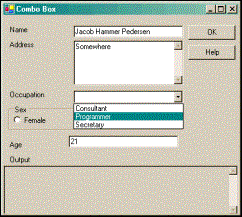 |
The ListView Control
The list from which you select files to open in the standard dialog boxes in Windows is a ListView control Everything you can do to the view in the standard list view dialog (large icons, details view, and so on), you can do with the ListView provided with Visual Studio.NET:
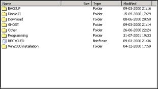 |
The list view is usually used to present data where the user is allowed some control over the detail and style of the presentation. It is possible to display the data contained in the control as columns and rows much like in a grid, as a single column or in with varying icon representations. The most commonly used list view is like the one seen above which is used to navigate the folders on a computer.
The ListView control is easily the most complex control we're going to encounter in this chapter, and covering all of it is beyond the scope of this book. What we'll do is provide a solid base for you to work on by writing an example that utilizes many of the most important features of the ListView control, and by a thorough description of the numerous properties, events, and methods that can be used. We'll also take a look at the ImageList control, which is used to store the images used in a ListView control.
ListView Properties
| Name | Availability | Description |
| Activation | Read/Write | By using this property, you can control how a user activates an item in the list view. You should not change the default setting unless you have a good reason for doing so, because you will be altering a setting that the user have set for his or her entire system. The possible values are: ·Standard: This setting is that which the user has chosen for his or her machine. ·OneClick: Clicking an item activates it. ·TwoClick: Double-clicking an item activates it. |
| Alignment | Read/Write | This property allows you to control how the items in the list view are aligned. The four possible values are: · Default: If the user drags and drops an item it remains where he or she dropped it. · Left: Items are aligned to the left edge of the ListView control. · Top: Items are aligned to the top edge of the ListView control. · SnapToGrid: The ListView control contains an invisible grid to which the items will snap. |
| AllowColumn Reorder | Read/Write | If you set this property to true, you allow the user to change the order of the columns in a list view. If you do so, you should be sure that the routines that fill the list view are able to insert the items properly, even after the order of the columns is changed. |
| AutoArrange | Read/Write | If you set this property to true, items will automatically arrange themselves according to the Alignment property. If the user drags an item to the center of the list view, and Alignment is Left, then the item will automatically jump to the left of the list view. This property is only meaningful if the View property is LargeIcon or SmallIcon. |
| CheckBoxes | Read/Write | If you set this property to true, every item in the list view will have a CheckBox displayed to the left of it. This property is only meaningful if the View property is Details or List. |
| CheckedIndices CheckedItems | Read-only | These two properties gives you access to a collection of indices and items, respectively, containing the checked items in the list. |
| Columns | Read-only | A list view can contain columns. This property gives you access to the collection of columns through which you can add or remove columns. |
| FocusedItem | Read-only | This property holds the item that has focus in the list view. If nothing is selected, it is null. |
| FullRowSelect | Read/Write | When this property is true, and an item is clicked, the entire row in which the item resides will be highlighted. If it is false, only the item itself will be highlighted. |
| GridLines | Read/Write | Setting this property to true will cause the list view to draw grid lines between rows and columns. This property is only meaningful when the View property is Details. |
| HeaderStyle | Read/Write | You can control how the column headers are displayed. There are three styles: ·Clickable: The column header works like a button. ·NonClickable: The column headers do not respond to mouse clicks. ·None: The column headers are not displayed. |
| HoverSelection | Read/Write | When this property is true, the user can select an item in the list view by hovering the mouse pointer over it. |
| Items | Read-only | The collection of items in the list view. |
| LabelEdit | Read/Write | When this property is true, the user can edit the content of the first column in a Details view. |
| LabelWrap | Read/Write | If this property is true, labels will wrap over as many lines is needed to display all of the text. |
| LargeImageList | Read/Write | This property holds the ImageList, which holds large images. These images can be used when the View property is LargeIcon. |
| MultiSelect | Read/Write | Set this property to true to allow the user to select multiple items. |
| Scrollable | Read/Write | Set this property to true to display scrollbars. |
| SelectedIndices SelectedItems | Read-only | These two properties contain the collections that hold the indices and items that are selected, respectively. |
| SmallImageList | Read/Write | When the View property is SmallIcon this property holds the ImageList that contain the images used. |
| Sorting | Read/Write | You can allow the list view to sort the items it contains. There are three possible modes: ·Ascending ·Descending ·None |
| StateImageList | Read/Write | The ImageList contains masks for images that are used as overlays on the LargeImageList and SmallImageList images to represent custom states. |
| TopItem | Read-only | Returns the item at the top of the list view. |
| View | Read/Write | A list view can display its items in four different modes: ·LargeIcon: All items are displayed with a large icon (32x32) and a label. ·SmallIcon: All items are displayed with a small icon (16x16) and a label. ·List: Only one column is displayed. That column can contain an icon and a label. ·Details: Any number of columns can be displayed. Only the first column can contain an icon. |
ListView Methods
For a control as complex as the list view, there are surprisingly few methods specific to it. They are all described in the table below:
| Name | Description |
| BeginUpdate | By calling this method, you tell the list view to stop drawing updates until EndUpdate is called. This is useful when you are inserting many items at once, because it stops the view from flickering and dramatically increases speed. |
| Clear | Clears the list view completely. All items and columns are removed. |
| EndUpdate | Call this method after calling BeginUpdate. When you call this method, the list view will draw all of its items. |
| EnsureVisible | When you call this method, the list view will scroll itself to make the item with the index you specified visible. |
| GetItemAt | Returns the item at position x,y in the list view. |
ListView Events
And these are the ListView control events that you might want to handle:
| Name | Description |
| AfterLabelEdit | This event occurs after a label have been edited |
| BeforeLabelEdit | This event occurs before a user begins editing a label |
| ColumnClick | This event occurs when a column is clicked |
| ItemActivate | Occurs when an item is activated |
ListViewItem
An item in a list view is always an instance of the ListViewItem class. The ListViewItem holds information such as text and the index of the icon to display. ListViewItems have a collection called SubItems that holds instances of another class, ListViewSubItem. These sub items are displayed if the ListView control is in Details mode. Each of the sub items represents a column in the list view. The main difference of the sub items and the main items is that a sub item cannot display an icon.
You add ListViewItems to the ListView through the Items collection and ListViewSubItems to a ListViewItem through the SubItems collection on the ListViewItem.
ColumnHeader
To make a list view display column headers, you add instances of a class called ColumnHeader to the Columns collection of the ListView. ColumnHeaders provide a caption for the columns that can be displayed when the ListView is in Details mode.
The ImageList Control
The ImageList control provides a collection that can be used to store images that is used in other controls on your form. You can store images of any size in an image list, but within each control every image must be of the same size. In the case of the ListView, which means that you need two ImageList controls to be able to display both large and small images.
The ImageList is the first control we've visited in this chapter that does not display itself at runtime. When you drag it to a form you are developing, it'll not be placed on the form itself, but below it in a tray, which contains all such components. This nice feature is provided to stop controls that are not part of the user interface from clogging up the forms designer. The control is manipulated in exactly the same way as any other control, except that you cannot move it around.
You can add images to the ImageList at both design and runtime. If you know at design time which images you'll need to display, you can add the images by clicking the button at the right hand side of the Images property. This will bring up a dialog on which you can browse to the images you wish to insert. If you choose to add the images at runtime, you add them through the Images collection.
Please see the ListView example below for an example of how to use this control.
Try it Out – ListView Example
The best way of learning about using a ListView control and its associated image lists is through an example. We'll create a dialog with a ListView and two ImageLists. The ListView will display files and folders on your hard drive. For the sake of simplicity, we will not be extracting the correct icons from the files and folders, but rather use a standard folder icon for the folders and an information icon for files.
By double-clicking the folders, you can browse into the folder tree and a back button is provided to move up the tree. Four radio buttons are used to change the mode of the list view at runtime. If a file is double-clicked, we'll attempt to execute it.
As always, we'll start by creating the user interface:
1. Create a new Visual Studio.NET project called ListView. Add a ListView, a button, a label, and a group box to the form. Then add four radiovbuttons to the group box to get a form that looks like the picture below:
 |
2. Name the controls as shown in the picture above. The ListView will not display its name as in the picture above; I've added an item to it to provide the name. You should not do so.
3. Change the Text properties of the radio buttons and button to the same as the name, except for the first three letters.
4. Clear the Text property of the label.
5. Add two ImageLists to the form by double-clicking the control's icon in the Toolbox (you'll have to scroll down to find it). Rename them ilSmall and ilLarge.
6. Change the Size property of the ImageList named ilLarge to 32, 32.
7. Click the button to the right of the Images property of the ilLage image list to bring up the dialog on which you can browse to the images you want to insert.
8. Click Add and browse to the folder under Visual Studio.NET that contains the images. The files are:
<Drive>:\Program Files\Visual Studio.NET\Common7\Graphics\Icons\Win95\clsdfold.ico
and
<Drive>:\Program Files\Visual Studio.NET\Common7\Graphics\Icons\Computer\msgbox04.ico
9. Make sure the folder icon is at the top of the list.
10. Repeat steps 7 and 8 with the other ImageList, ilSmall.
11. Set the Checked property of the radio button rdoDetails to true.
12. Set the following properties on the list view:
MultiSelect = true
LargeImageList = ilLarge
SmallImageList = ilSmall
View = Details
13. Change the Text properties of the form and Frame as shown in the picture above.
Adding the Event Handlers
That concludes our user interface and we can move on to the code. First of all, we'll need a field to hold the folders we've browsed through in order to be able to return to them when the back button is clicked. We will store the absolute path of the folders, and so we choose a StringCollection for the job:
public class Form1 : System.Windows.Forms.Form
{
   // Member field to hold previous folders
   private System.Collections.Specialized.StringCollection folderCol;
We didn't create any column headers in the forms designer, so we'll have to do that now. We create them in a method called CreateHeadersAndFillListView():
private void CreateHeadersAndFillListView()
{
   ColumnHeader colHead;

   // First header
   colHead = new ColumnHeader();
   colHead.Text = "Filename";
   this.lwFilesAndFolders.Columns.Add(colHead); // Insert the header

   // Second header
   colHead = new ColumnHeader();
   colHead.Text = "Size";
   this.lwFilesAndFolders.Columns.Add(colHead); // Insert the header

   // Third header
   colHead = new ColumnHeader();
   colHead.Text = "Last accessed";
   this.lwFilesAndFolders.Columns.Add(colHead); // Insert the header
}
We start by declaring a single variable, colHead, which we will use to create the three column headers. For each of the three headers we new the variable, and assign the Text to it before adding it to the Columns collection of the ListView.
The final initialization of the form as it is displayed the first time, is to fill the list view with files and folders from your hard disk. This is done in another method:
private void PaintListView(string root)
{
   try
   {
      // Two local variables that is used to create the items to insert
      ListViewItem lvi;
      ListViewItem.ListViewSubItem lvsi;

      // If there's no root folder, we can't insert anything
      if (root.CompareTo("") == 0)
         return;

      // Get information about the root folder.
      System.IO.DirectoryInfo dir = new System.IO.DirectoryInfo(root);

      // Retrieve the files and folders from the root folder.
      DirectoryInfo[] dirs = dir.GetDirectories(); // Folders
      FileInfo[] files = dir.GetFiles();           // Files

      // Clear the ListView. Note that we call the Clear method on the
      // Items collection rather than on the ListView itself.
      // The Clear method of the ListView remove everything, including column
      // headers, and we only want to remove the items from the view.
      this.lwFilesAndFolders.Items.Clear();

      // Set the label with the current path
      this.lblCurrentPath.Text = root;

      // Lock the ListView for updates
      this.lwFilesAndFolders.BeginUpdate();

      // Loop through all folders in the root folder and insert them
      foreach (System.IO.DirectoryInfo di in dirs)
      {
         // Create the main ListViewItem
         lvi = new ListViewItem();
         lvi.Text = di.Name; // Folder name
         lvi.ImageIndex = 0; // The folder icon has index 0
         lvi.Tag = di.FullName; // Set the tag to the qualified path of the
                             // folder

         // Create the two ListViewSubItems.
         lvsi = new ListViewItem.ListViewSubItem();
         lvsi.Text = ""; // Size - a folder has no size and so this column
                         // is empty
         lvi.SubItems.Add(lvsi); // Add the sub item to the ListViewItem

         lvsi = new ListViewItem.ListViewSubItem();
         lvsi.Text = di.LastAccessTime.ToString(); // Last accessed column
         lvi.SubItems.Add(lvsi); // Add the sub item to the ListViewItem

         // Add the ListViewItem to the Items collection of the ListView
         this.lwFilesAndFolders.Items.Add(lvi);
      }

      // Loop through all the files in the root folder
      foreach (System.IO.FileInfo fi in files)
      {
         // Create the main ListViewItem
         lvi = new ListViewItem();
         lvi.Text = fi.Name; // Filename
         lvi.ImageIndex = 1; // The icon we use to represent a folder has
         // index 1
         lvi.Tag = fi.FullName; // Set the tag to the qualified path of the
         // file

         // Create the two sub items
         lvsi = new ListViewItem.ListViewSubItem();
         lvsi.Text = fi.Length.ToString(); // Length of the file
         lvi.SubItems.Add(lvsi); // Add to the SubItems collection

         lvsi = new ListViewItem.ListViewSubItem();
         lvsi.Text = fi.LastAccessTime.ToString(); // Last Accessed Column
         lvi.SubItems.Add(lvsi); // Add to the SubItems collection

         // Add the item to the Items collection of the ListView
         this.lwFilesAndFolders.Items.Add(lvi);
      }

      // Unlock the ListView. The items that have been inserted will now
      // be displayed
      this.lwFilesAndFolders.EndUpdate();
   }
   Catch (System.Exception err)
   {
      MessageBox.Show("Error: " + err.Message);
   }
}
Before the first of the two foreach blocks, we call BeginUpdate() on the ListView control. Remember that the BeginUpdate() method on the ListView signals the ListView control to stop updating its visible area until EndUpdate() is called. If we did not call this method, filling the list view would be slower and the list may flicker as the items are added. Just after the second foreach block we call EndUpdate(), which makes the ListView control draw the items we've filled it with.
The two foreach blocks contain the code we are interested in. We start by creating a new instance of a ListViewItem, and then setting the Text property to the name of the file or folder we are going to insert. The ImageIndex of the ListViewItem refers to the index of an item in one of the ImageLists. Because of that, it is important that the icons have the same indexes in the two ImageLists. We use the Tag property to save the fully qualified path to both folders and files, for use when the user double-clicks the item.
Then we create the two sub items. These are simply assigned the text to display and then added to the SubItems collection of the ListViewItem.
Finally, the ListViewItem is added to the Items collection of the ListView. The ListView is smart enough to simply ignore the sub items, if the view mode is anything but Details, so we add the sub items no matter what the view mode is now.
All that remains to be done for the list view to display the root folder, is to call the two functions in the constructor of the form. At the same time, we instantiate the folderColStringCollection with the root folder:
InitializeComponent();

// Init ListView and folder collection
folderCol = new System.Collections.Specialized.StringCollection();
CreateHeadersAndFillListView();
PaintListView(@"C:\");
folderCol.Add(@"C:\");
In order to allow the user to double-click an item in the ListView to browse the folders, we need to subscribe to the ItemActivate event. We add the subscription to the constructor:
this.lwFilesAndFolders.ItemActivate += new
                   System.EventHandler(this.lwFilesAndFolders_ItemActivate);
The corresponding event handler looks like this:
private void lwFilesAndFolders_ItemActivate(object sender, System.EventArgs e)
{
   // Cast the sender to a ListView and get the tag of the first selected
   // item.
   System.Windows.Forms.ListView lw = (System.Windows.Forms.ListView)sender;
   string filename = lw.SelectedItems[0].Tag.ToString();

   if (lw.SelectedItems[0].ImageIndex != 0)
   {
      try
      {
         // Attempt to run the file
         System.Diagnostics.Process.Start(filename);
      }
      catch
      {
         // If the attempt fails we simply exit the method
         return;
      }
   }
   else
   {
      // Insert the items
      PaintListView(filename);
      folderCol.Add(filename);
   }
}
The tag of the selected item contains the fully qualified path to the file or folder that was double-clicked. We know that the image with index 0 is a folder, so we can determine whether the item is a file or a folder by looking at that index. If it is a file, we attempt to load the file.
If it is a folder, we call PaintListView with the new folder, and then add the new folder to the folderCol collection.
Before we move on to the radio buttons, we'll complete the browsing abilities by adding the click event to the Back button. Double-click the button and fill the event handle with this code:
private void btnBack_Click(object sender, System.EventArgs e)
{
   if (folderCol.Count > 1)
   {
      PaintListView(folderCol[folderCol.Count-2].ToString());
      folderCol.RemoveAt(folderCol.Count-1);
   }
   else
   {
      PaintListView(folderCol[0].ToString());
   }
}
If there is more than one item in the folderCol collection, then we are not at the root of the browser, and we call PaintListView with the path to the previous folder. The last item in the folderCol collection is the current folder, which is why we need to take the second to last item. We then remove the last item in the collection, and make the new last item the current folder. If there is only one item in the collection, we simply call PaintListView with that item.
All that remains is to be able to change the view type of the list view. Double-click each of the radio buttons and add the following code:
private void rdoLarge_CheckedChanged(object sender, System.EventArgs e)
{
   RadioButton rdb = (RadioButton)sender;
   if (rdb.Checked)
      this.lwFilesAndFolders.View = View.LargeIcon;
}

private void rdoList_CheckedChanged(object sender, System.EventArgs e)
{
   RadioButton rdb = (RadioButton)sender;
   if (rdb.Checed)
      this.lwFilesAndFolders.View = View.List;
}

private void rdoSmall_CheckedChanged(object sender, System.EventArgs e)
{
   RadioButton rdb = (RadioButton)sender;
   if (rdb.Checked)
      this.lwFilesAndFolders.View = View.SmallIcon;
}

private void rdoDetails_CheckedChanged(object sender, System.EventArgs e)
{
   RadioButton rdb = (RadioButton)sender;
   if (rdb.Checked)
      this.lwFilesAndFolders.View = View.Details;
}
We check the radio button to see if it changed to Checked and if it was, we set the View property of the ListView accordingly.
That concludes the ListView example. When you run it, you should see something like this:
 |
The StatusBar Control
A status bar is commonly used to provide hints for the selected item or information about an action currently being performed on a dialog. Normally, the StatusBar is placed at the bottom of the screen, as it is in MS Office applications, but it can be located anywhere you like. The status bar that is provided with Visual Studio.NET can be used to simply display a text or you can add panels to it and display text, or create your own routines for drawing the contents of the panel:
 |
The above picture shows the status bar as it looks in MS Word. The panels in the status bar can be identified as the sections that appear sunken.
StatusBar Properties
As mentioned above, you can simply assign to the Text property of a StatusBar control to display simple text to the user, but it is possible to create panels and use them to the same effect:
| Name | Availability | Description |
| BackgroundImage | Read/Write | It is possible to assign an image to the status bar that will be drawn in the background. |
| Panels | Read-only | This is the collection of panels in the status bar. Use this collection to add and remove panels. |
| ShowPanels | Read/Write | If you want to display panels, this property must be set to true. |
| Text | Read/Write | When you are not using panels this property holds the text that is displayed in the status bar. |
StatusBar Events
There are not a whole lot of new events for the status bar, but if you are drawing a panel manually, the DrawItem event is of crucial importance:
| Name | Description |
| DrawItem | Occurs when a panel that has the OwnerDraw style set needs to be redrawn. You must subscribe to this event if you want to draw the contents of a panel yourself. |
| PanelClick | Occurs when a panels is clicked. |
The StatusBarPanel Class
Each panel in a status bar is an instance of the StatusBarPanel class. This class contains all the information about the individual panels in the Panels collection. The information that can be set ranges from simple text and alignment of text to icons to be displayed and the style of the panel.
If you want to draw the panel yourself, you must set the Style property of the panel to OwnerDraw and handle the DrawItem event of the StatusBar.
StatusBar Example
We'll change the ListView example we created earlier to demonstrate the use of the StatusBar control. We'll remove the label used to display the current folder and move that piece of information to a panel on a status bar. We'll also display a second panel, which will display the current view mode of the list view:
1. Remove the label lblCurrentFolder.
2. Double-click the StatusBar control in the toolbox to add it to the form (again it is near to the bottom of the list). The new control will automatically dock with the bottom edge of the form.
3. Change the name of the StatusBar to sbInfo and clear the Text property.
4. Find the Panels property and double-click the button to the right of it to bring up a dialog to add panels.
5. Click Add to add a panel to the collection. Set the AutoSize property to Spring. This means that the panel will share the space in the StatusBar with other panels.
6. Click Add again, and change the AutoSize property to Contents. This means that the panel will resize itself to the size of the text it contains. Set the MinSize property to 0.
7. Click OK to close the dialog.
8. Set the ShowPanels property on the StatusBar to true.
This example can be found in the code download for this chapter as the StatusBar Visual Studio.NET project.
Adding the Event Handlers
That's it for the user interface and we'll move on to the code. We'll start by setting the current path in the PaintListView method. Remove the line that set the text in the label and insert the following in its place:
this.sbInfo.Panels[0].Text = root;
The first panel has index 0, and we simply set its Text property just as we set the Text property of the label. Finally, we change the four radio button CheckedChanged events to set the text of the second panel:
private void rdoLarge_CheckedChanged(object sender, System.EventArgs e)
{
   RadioButton rdb = (RadioButton)sender;
   if (rdb.Checked)
   {
      this.lwFilesAndFolders.View = View.LargeIcon;
      this.sbInfo.Panels[1].Text = "Large Icon";
   }
}

private void rdoList_CheckedChanged(object sender, System.EventArgs e)
{
   RadioButton rdb = (RadioButton)sender;
   if (rdb.Checked)
   {
      this.lwFilesAndFolders.View = View.List;
      this.sbInfo.Panels[1].Text = "List";
   }
}

private void rdoSmall_CheckedChanged(object sender, System.EventArgs e)
{
   RadioButton rdb = (RadioButton)sender;
   if (rdb.Checked)
   {
      this.lwFilesAndFolders.View = View.SmallIcon;
      this.sbInfo.Panels[1].Text = "Small Icon";
   }
}

private void rdoDetails_CheckedChanged(object sender, System.EventArgs e)
{
   RadioButton rdb = (RadioButton)sender;
   if (rdb.Checked)
   {
      this.lwFilesAndFolders.View = View.Details;
      this.sbInfo.Panels[1].Text = "Details";
   }
}
The panel text is set in exactly the same way as in PaintListView above.
That concludes the StatusBar example. If you run it now, you should see something like this:
 |
The TabControl Control
The TabControl provides an easy way of organizing a dialog into logical parts that can be accessed through tabs located at the top of the control. A TabControl contains TabPages that essentially work in a similar way to a GroupBox control, though it is somewhat more complex:
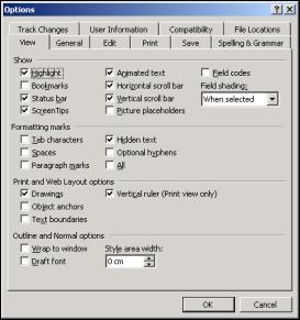 |
The above screen shot shows the Options dialog in MS Word 2000 as it is typically configured. Notice the two rows of tabs at the top of the dialog. Clicking each of them will show a different selection of controls in the rest of the dialog. This is a very good example of how to use a tab control to group related information together, making it easier for the user to find the information s/he is looking for.
Using the tab control is very easy. You simply add the number of tabs you want to display to the control's TabPages collection and then drag the controls you want to display to the respective pages.
At runtime, you can navigate the tabs through the properties of the control.
TabControl Properties
The properties of the TabControl are largely used to control the appearance of the container of TabPages, in particular the tabs displayed:
| Name | Availability | Description |
| Alignment | Read/Write | Controls where on the tab control the tabs are displayed. The default is at the top. |
| Appearance | Read/Write | Controls how the tabs are displayed. The tabs can be displayed as normal buttons or with flat style. |
| HotTrack | Read/Write | If this property is set to true the appearance of the tabs on the control change as, the mouse pointer passes over them. |
| Multiline | Read/Write | If this property is set to true, it is possible to have several rows of tabs. |
| RowCount | Read-only | Returns the number of rows of tabs that is currently displayed. |
| SelectedIndex | Read/Write | Returns or sets the index of the selected tab. |
| TabCount | Read-only | Returns the total number of tabs. |
| TabPages | Read-only | This is the collection of TabPages in the control. Use this collection to add and remove TabPages. |
Working with the TabControl
The TabControl works a little differently from all other controls we've seen so far. When you drag the control on to a form, you will see a gray rectangle that doesn't look very much like the control in the screenshot as shown above. You will also see, below the Properties panel, two buttons that look like links with the captions Add Tab and Remove Tab. Clicking Add Tab will insert a new tab page on the control, and the control will start to be recognizable. Obviously, you can remove the tab with the Remove Tab link button.
The above procedure is provided in order for you to get up and running quickly with the control. If, on the other hand, you want to change the behavior or style of the tabs, you should use the TabPages dialog – accessed through the button when you select TabPages in the properties panel.
The TabPages property is also the collection used to access the individual pages on a tab control. Let's create an example to demonstrate the basics of the control. The example demonstrates how to controls located on different pages on the tab control:
1. Create a new C# Windows Application project and name it TabControl.
2. Drag a TabControl control from the toolbox to the form.
3. Click Add Tab to add a tab to the control.
4. Find the TabPages property and click the button to the right of it after selecting it.
5. Add another tab page to the control by clicking Add.
6. Change the Text property of the tab pages to Tab One and Tab Two respectively.
7. You can select the tab pages to work on by clicking on the tabs at the top of the control. Select the tab with the text TabOne. Drag a button on to the control. Be sure to place the button within the frame of the TabControl. If you place it outside, then the button will be placed on the form rather than on the control.
8. Change the name of the button to btnShowMessage and the Text of the button to Show Message.
9. Click on the tab with the Text property TabTwo. Drag a TextBox control onto the TabControl surface. Name this control txtMessage and clear the Text property.
10. Return to the form by clicking OK in the dialog. The two tabs should look like these two screenshots:
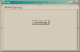 |
 |
Adding the Event Handler
We are now ready to access the controls. If you run the code as it is, you will see the tab pages displayed properly. All that remains for us to do to demonstrate the use of the tab control is add some code is that when the user clicks the Show Message button on one tab, the text entered in the other tab will be displayed in a message box. First, we add a handler for the Click event by double-clicking the button on the first tab and adding the following code:
private void btnShowMessage_Click(object sender, System.EventArgs e)
{
   // Access the TextBox

   MessageBox.Show(this.txtMessage.Text);
}
You access a control on a tab just as you would any other control on the form. We get the Text property of the TextBox and display it in a message box.
Earlier in the chapter, we saw that it is only possible to have one radio button selected at a time on a form (unless you put them in group boxes). The TabPages work in precisely the same way as group boxes and it is, therefore, possible to have mulitiple sets of radio buttons on different tabs without the need to have group boxes.
The last thing you must know to be able to work with a tab control, is how to determine which tab is currently being displayed. There are two properties you can use for this purpoase: SelectedTab and SelectedIndex. As the names imply, SelectedTab will return the TabPage object to you or null if no tab is selected, and SelectedIndex will return the index of the tab or –1 if no tab is selected.
Comments